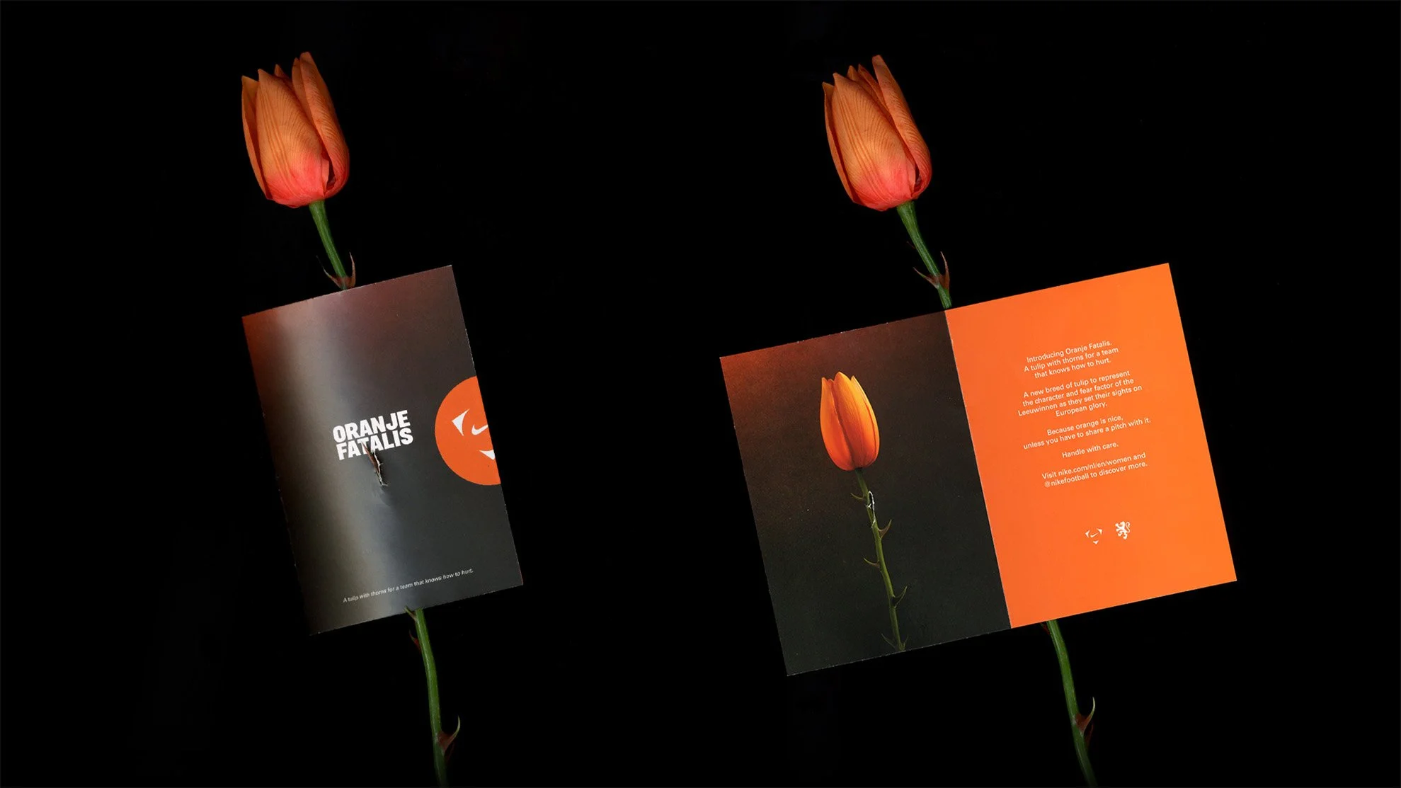
The Duality of ORANJE
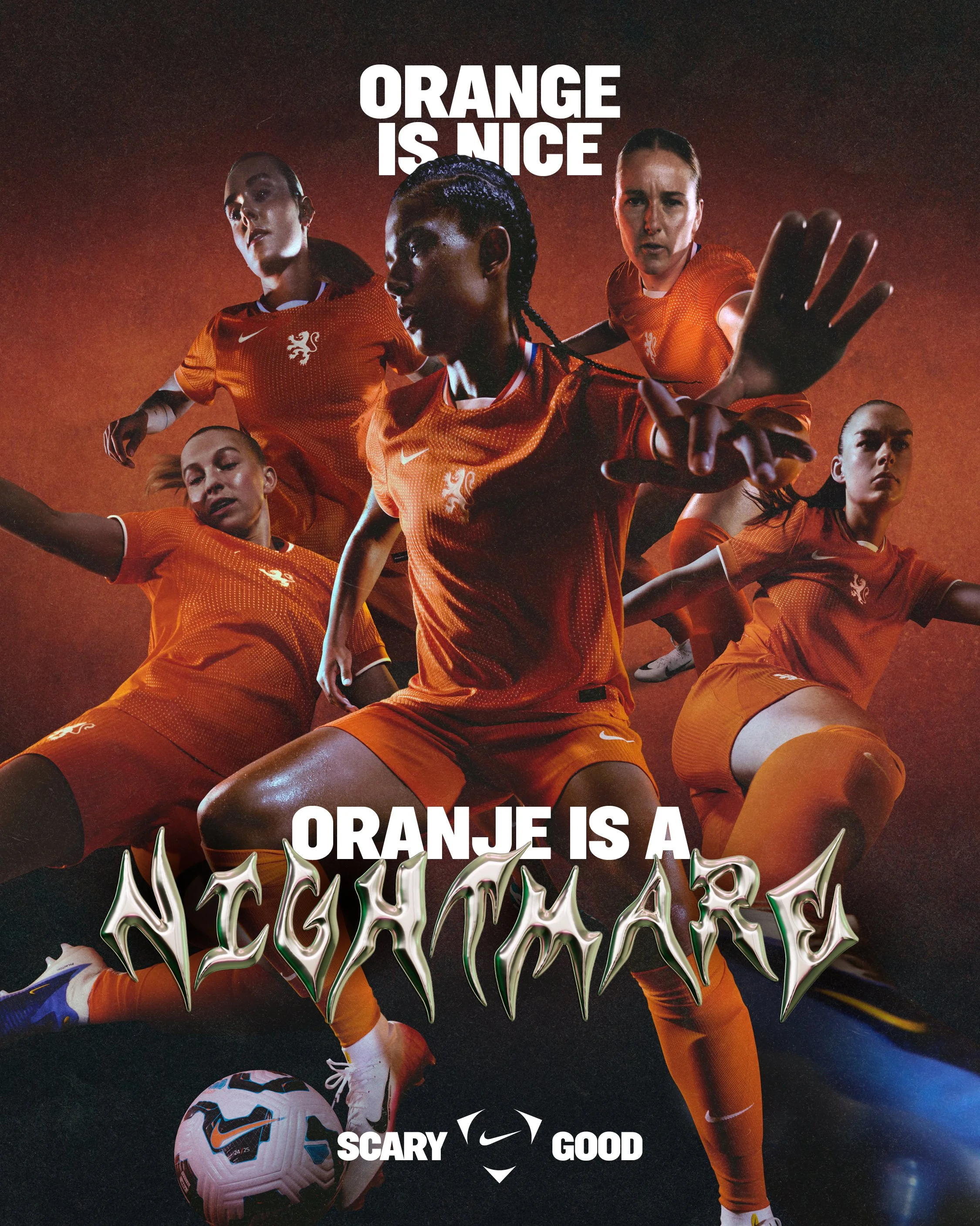
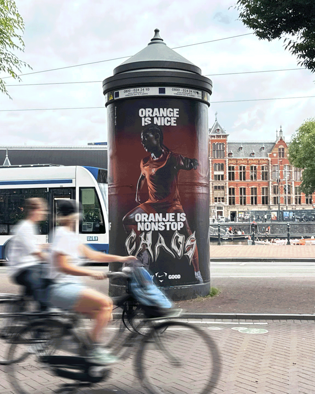
(Tension)ORANGE has become known as a ‘fun’ color in football—bright, friendly, and easy on the eye. It’s often seen as unthreatening, a color that doesn’t strike fear on the field. (Truth)ORANJE This team is rewriting that perception. ORANJE is no longer just a color—it’s a weapon.
@oranjeleeuwinnen #NikeFootball


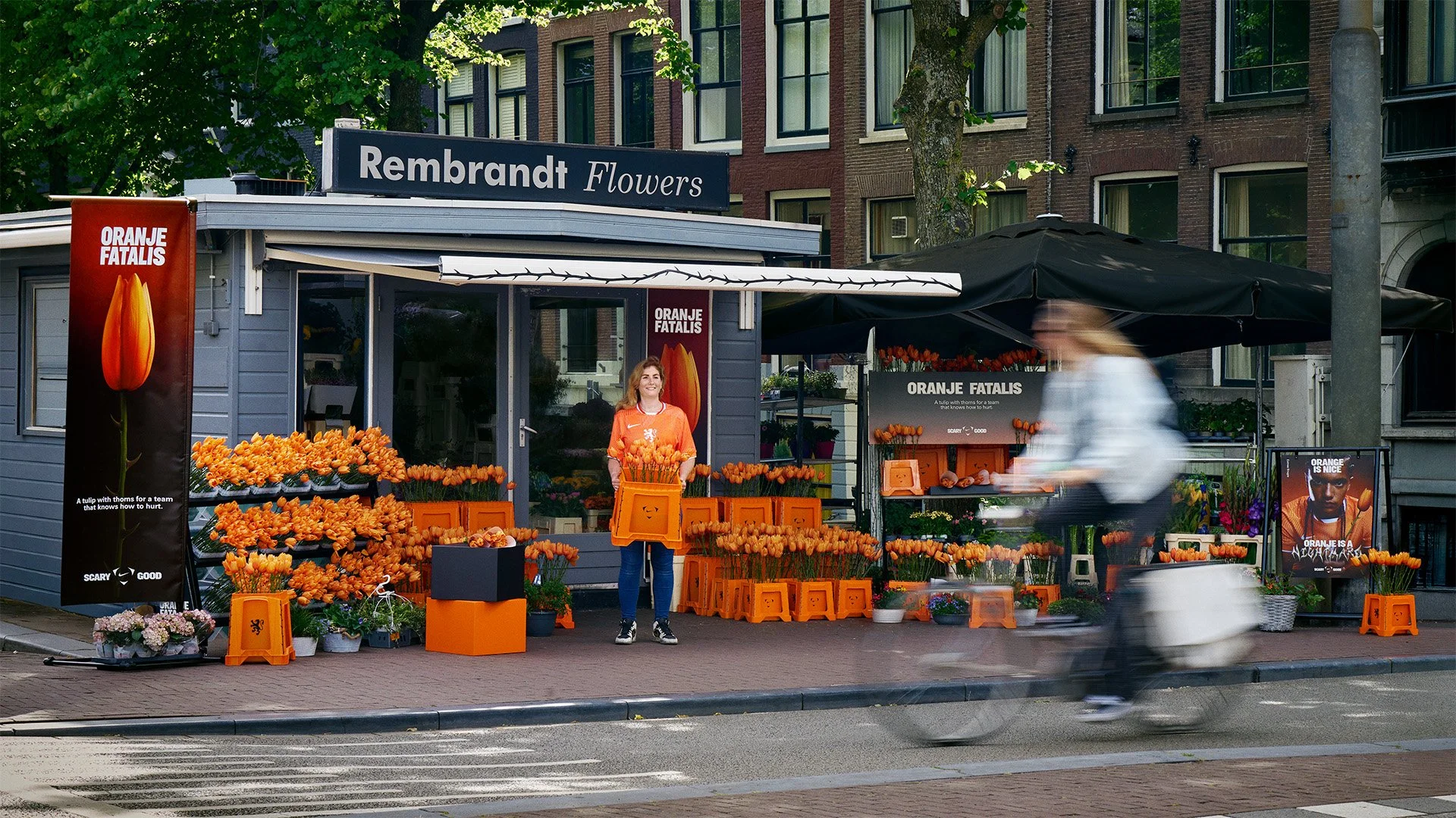

To celebrate the Netherlands women’s team ahead of the Euros,
We worked with Nike to revise one of the nation’s most iconic symbols. Created in collaboration with Dutch silk flower specialists Bloom & Wolf. The thorned tulips will be taking over flower stalls across Amsterdam* in the lead-up to match days, available exclusively to fans wanting to show their support.